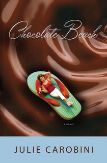
I agree--eye catching. BUT, if you have input, find out (there might be a reason--these marketing people know what they're doing) why the flip-flop and the backing of your name aren't the same color. Seems to me a color tie-in there might work the whole cover together more. (Does that make sense? I'm not explaining myself very well. I think I've run out of words today. HA!)
I like the flip-flop too! My only prob with it is that it's very dark colored with the chocolate. I think more of romance and chocolate than beach and sun and chocolate.
The flip-flop raft rocks! I have to agree with Camy though. The dark color doesn't sync with the name for me. Also, it's a little hard to read the title. Maybe if it was just slightly bolder, because I love the font!
I like the cover. The cover plus the title would definately catch my eye at the bookstore. Hopefully you'll be faced out:) I don't mind the darkness of the chocolate, but maybe the flip-flop could be bigger???
I agree the chocolate beach font should be better.
Also, I think the lady on the flip-flop can have more pizzazz. Julie, you have such awesome personality, and I know the book does too. So can we get a little more va-voohm?
I agree with Tricia. It's a great book and fun read that challenges while we're at it. But it's fun, and I think fun gets lost in all the chocolate. The flip-flop should be pink and polka-dotted to hint at the fun part of the book. And I think if they could photoshop in a real person versus the doll that would be better, too. How exciting!


14 comments:
Hi Julie! I love the book cover. I'd definitely buy it. :) (Well, I would anyway, but that's beside the point!)
Looks yummy. Congrats!
I love the flip-flop sandal boat.
And what could be better than floating in chocolate?
It's delicious.
I agree--eye catching. BUT, if you have input, find out (there might be a reason--these marketing people know what they're doing) why the flip-flop and the backing of your name aren't the same color. Seems to me a color tie-in there might work the whole cover together more. (Does that make sense? I'm not explaining myself very well. I think I've run out of words today. HA!)
Becky
I like the flip-flop too! My only prob with it is that it's very dark colored with the chocolate. I think more of romance and chocolate than beach and sun and chocolate.
Camy
I'm a guy, so I've just got one question:
I love the look of your cover, but... WHY isn't the babe on the board wearing a bikini?
Just a thought.
Dan N.
The flip-flop raft rocks! I have to agree with Camy though. The dark color doesn't sync with the name for me. Also, it's a little hard to read the title. Maybe if it was just slightly bolder, because I love the font!
Can't wait to read what's behind the cover!
Looks like a must read!
Ii'm thinking that the font for your title should be thicker. I'm with geekwif, it is a tad hard to read.
i'd buy it for the chocolate look alone.
(HOW EXCITING!!!)
I like the cover. The cover plus the title would definately catch my eye at the bookstore. Hopefully you'll be faced out:) I don't mind the darkness of the chocolate, but maybe the flip-flop could be bigger???
Thanks All for stopping by to see my first ever book cover. It's a kick to share it with you. I think it’s fun!
Here are some of the comments emailed directly to me:
*I'm drooling. I showed it to my twenty-year-old daughter and she agreed and said it was a book she would buy. Me, too. Let us know when. :)
*It’s a real "eye catcher and would certainly get all shoppers in the bookstore to stop and check it out!
*I love it -- it made my mouth water for that Starbucks liquid chocolate drink they serve.
See ya at the beach :-)
I LOVE the chocolate.
I think they can find a much cuter flip-flop.
I agree the chocolate beach font should be better.
Also, I think the lady on the flip-flop can have more pizzazz. Julie, you have such awesome personality, and I know the book does too. So can we get a little more va-voohm?
I agree with Tricia. It's a great book and fun read that challenges while we're at it. But it's fun, and I think fun gets lost in all the chocolate. The flip-flop should be pink and polka-dotted to hint at the fun part of the book. And I think if they could photoshop in a real person versus the doll that would be better, too. How exciting!
Looks yummy!
Post a Comment